OUR LABEL
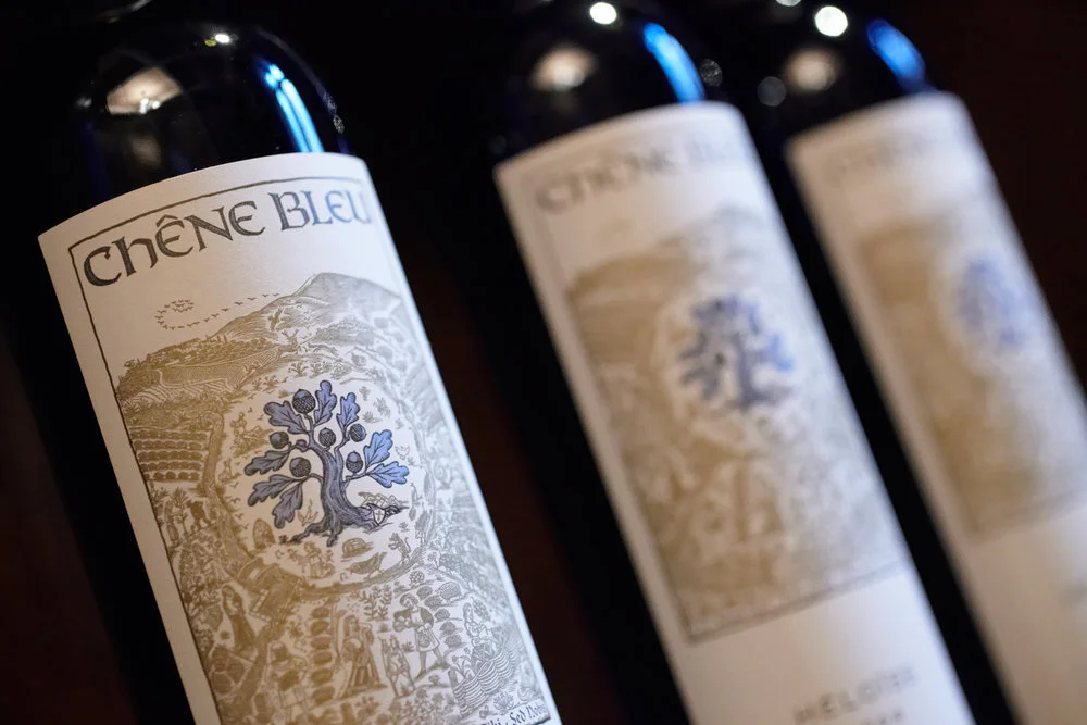
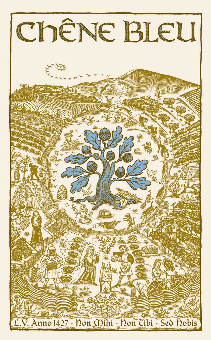
“The Chêne Bleu labeling is fun to explore. It’s Where’s Waldo meets medieval art, with numerous references buried in the details.”

“The Chêne Bleu labeling is fun to explore. It’s Where’s Waldo meets medieval art, with numerous references buried in the details.”
Packing so much history and philosophy into our label was not an easy feat.
"Our family wanted the distinctiveness of the place to come through in the wines but also in the iconography of our label design. There was so much to tell about this special little enclave, its historical vineyard and its unusual terroir pullulating with life!
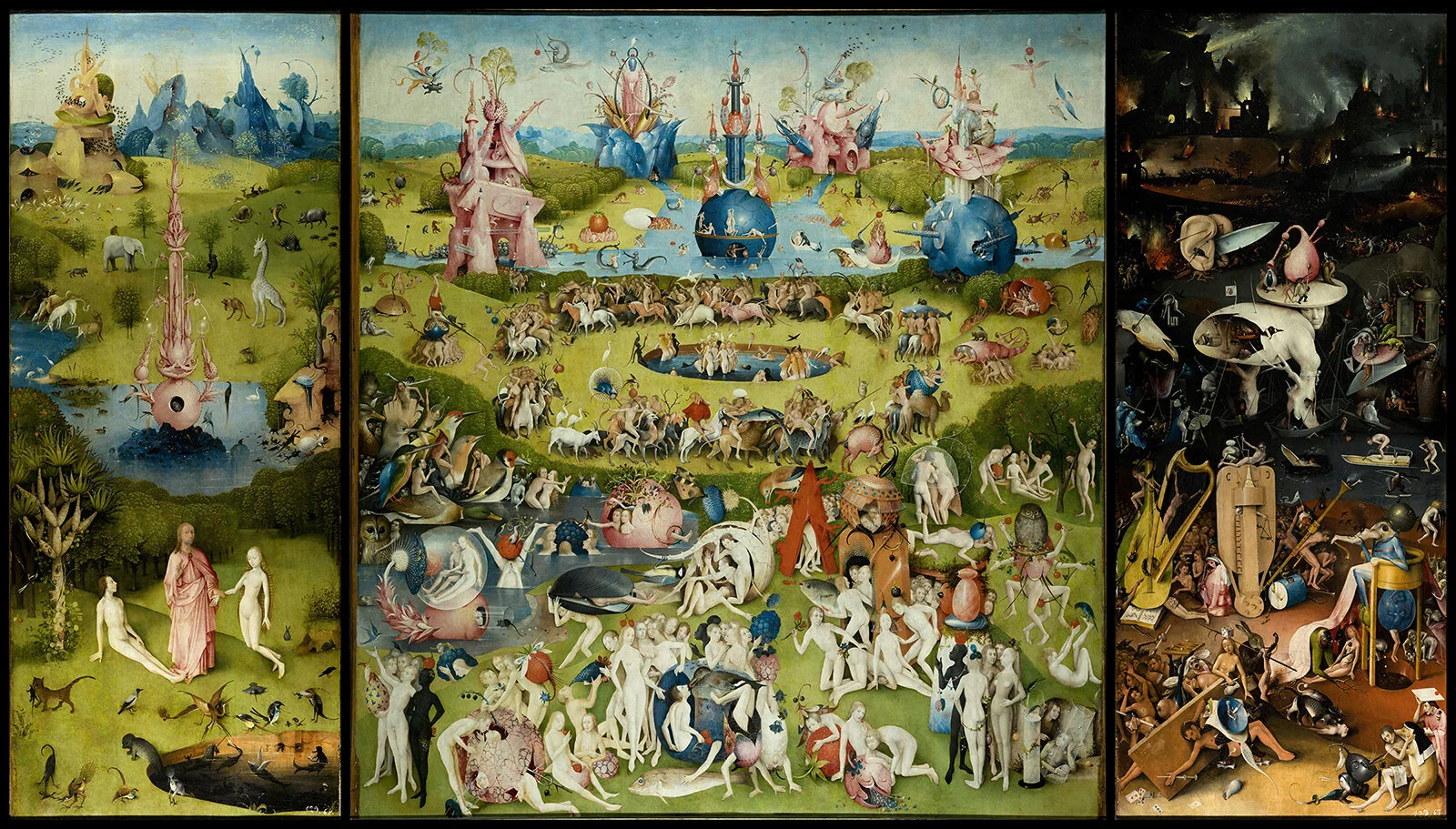
“The Garden of Earthly Delights” by Hieronymus Bosch
Lacking the budget to hire an agency, I had to rely on my own thinking and research. The label had to have a medieval look and feel, reflecting the ancient roots of the property, but also to make reference to this new chapter of its life and our ambitious vision for its future.
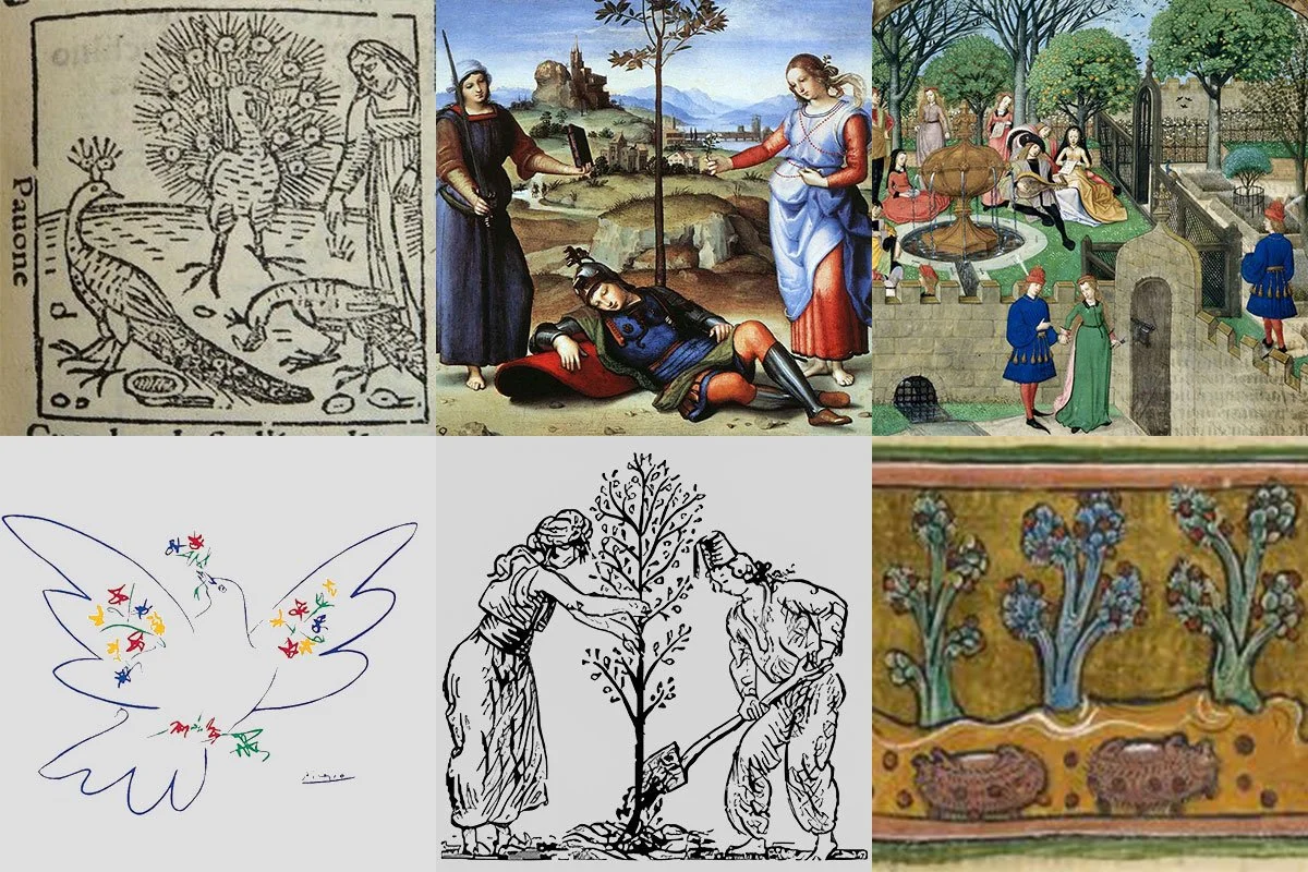
I set out on my own mini medieval-style pilgrimage to source illuminations from manuscript marginalia and medieval bestiaries. Inspiration came from so many places, including the Benedictine Abbey of Cluny, the medieval Musée de Cluny in Paris, and the Met Cloisters of the Metropolitan Museum in New York.
With the help of the wonderful Neil Tully MW at Amphora and Alex Gallé at Gallé Design, began putting it all together. The process seemed endless, and eventually my family was bored of waiting for me to complete the label, annoyed that our first wines were ready for release but that the label was not finished.
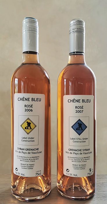
For that reason, we were forced to come up with a temporary label for the very first wines of our very first vintage, ‘Label Under Construction’. We still have a few of these bottles in our library for fun and, if you look closely, you can find a reference to it in our existing label.
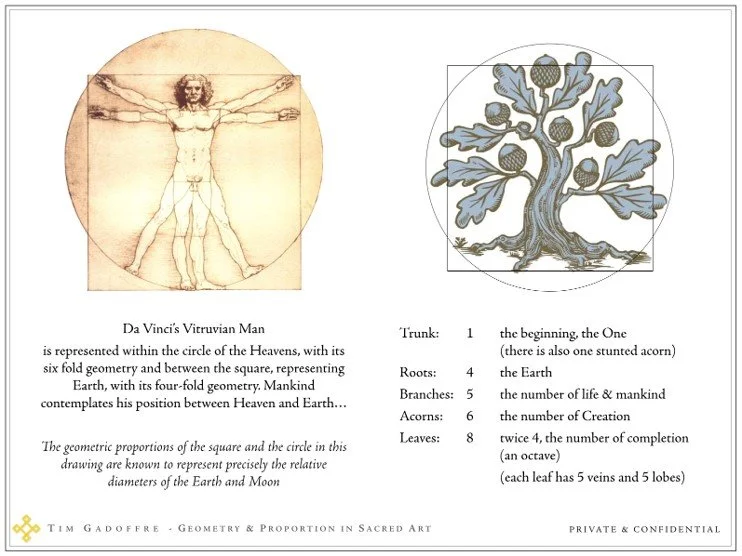
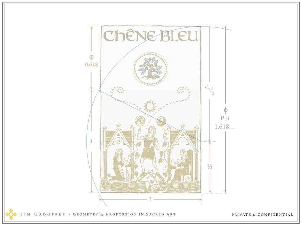
Golden rules and sacred geometry guided our label framework.
Late one night, looking up the reference of Hieronymus Bosch’s Paradise panel in his famous triptych ‘The Garden of Earthly Delights’, I realized the structure of that painting was strangely similar to the de facto triangle of our house in relation to Mont Ventoux and the Blue Oak at the bottom of the hill.
Suddenly I had the template for our label — I felt as if I had cracked a Da Vinci code! Using sacred geometry, Palladian ratios, golden rules and Leonardo’s Vitruvian Man, all the elements I wanted to share fell into place.
Through Neil I collaborated with the wonderful illustrator Jane Randfield, who then patiently engraved these images.” – Nicole Rolet
The result is a label which can be read on many levels. There are literal representations of animals on the estate; metaphors of our family’s ‘Circle of Life’; allegories depicting the philosophies that guide us; vignettes of characters such as Voltaire’s Candide, according to whom “one must cultivate one’s own garden” to discover the ultimate meaning of life; Cicero’s treatise of ‘The Dream of Scipio’ regarding the defining choices we make at the crossroads of life between excessive luxury and true virtue.
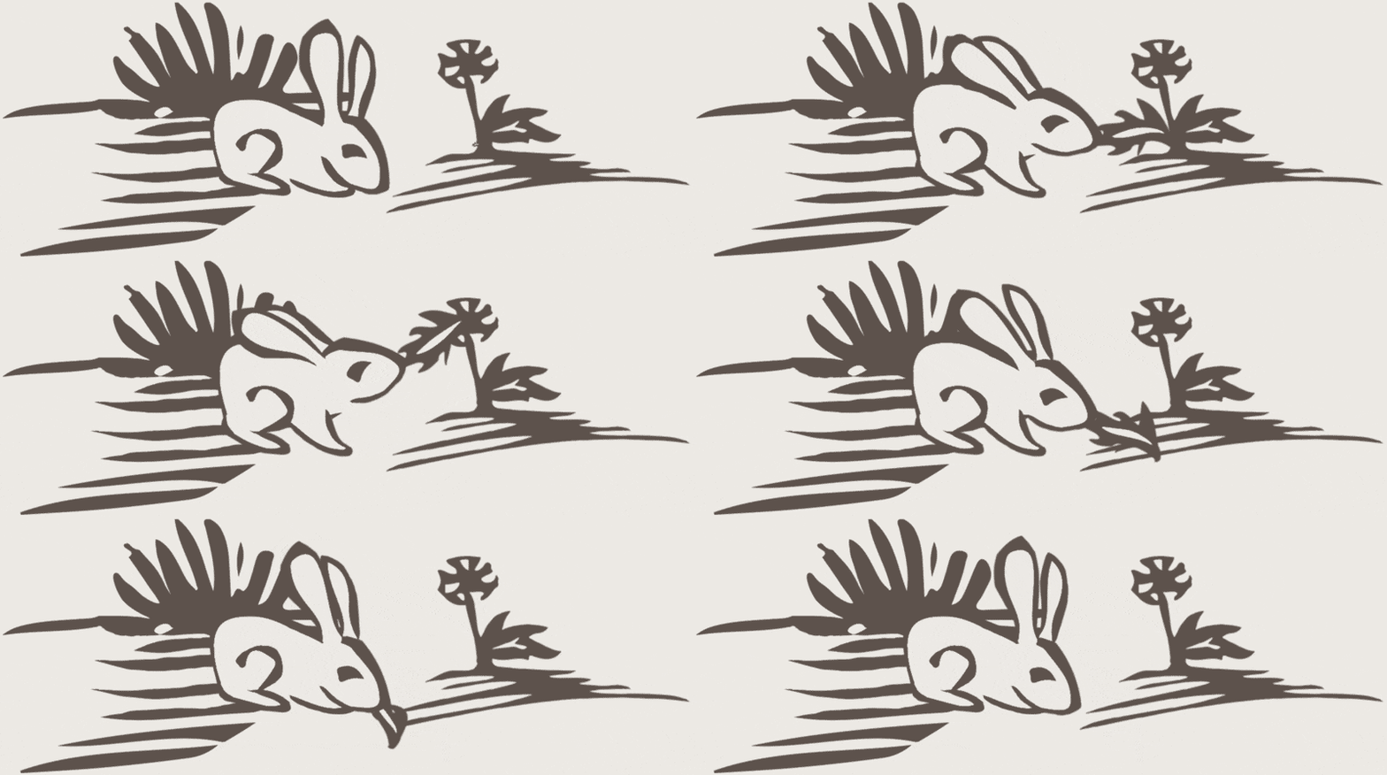
Plus, alongside the serious references and allegories in our label, eagle-eyed observers can engage in a little bunny hunt in the illustration. What’s more, since our first vintage in 2006, we hide another rabbit to the image every ten years. Find the five white bunnies and one black hare to win a pleasing prize. It’s our way of thanking you for taking the time to learn about the unique ecology of our vineyard.
Found your bunnies and ready for your next challenge? There are many dozens more, so get in touch with us at contact@chenebleu.com.
We came across this charming video, which beautifully demonstrates how Hedgehogs gather grapes in the vineyard (volume can be adjusted).
“Look closely and you’ll see dozens of tiny, significant and humorous, details.”